King 5 News | Mobile UX design | Redesign navigation & news feed
The problem
In 2019, King 5 News revamped their mobile app with a redesigned user interface. Users faced challenges in navigation and noted a scarcity of news topics in the main feed. To address this, I improved the navigation system and diversified the main news feed for an enhanced user experience.
The outcome
The new quick navigation and updated menu seamlessly guide users to specific news stories. The diverse range of news topics on the main feed earned positive user feedback.
My contribution
I led the full design of this case study, from research through visual design.
Discovery
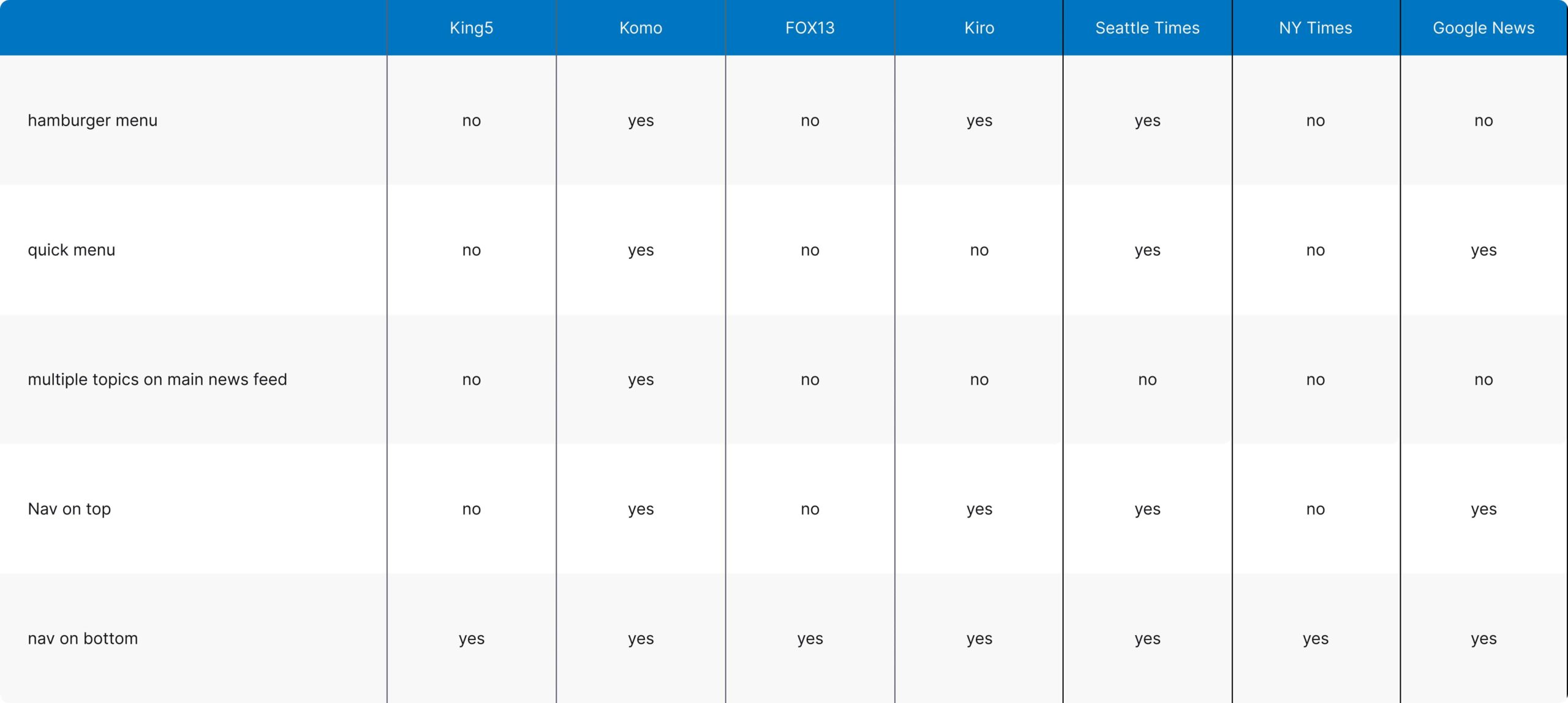
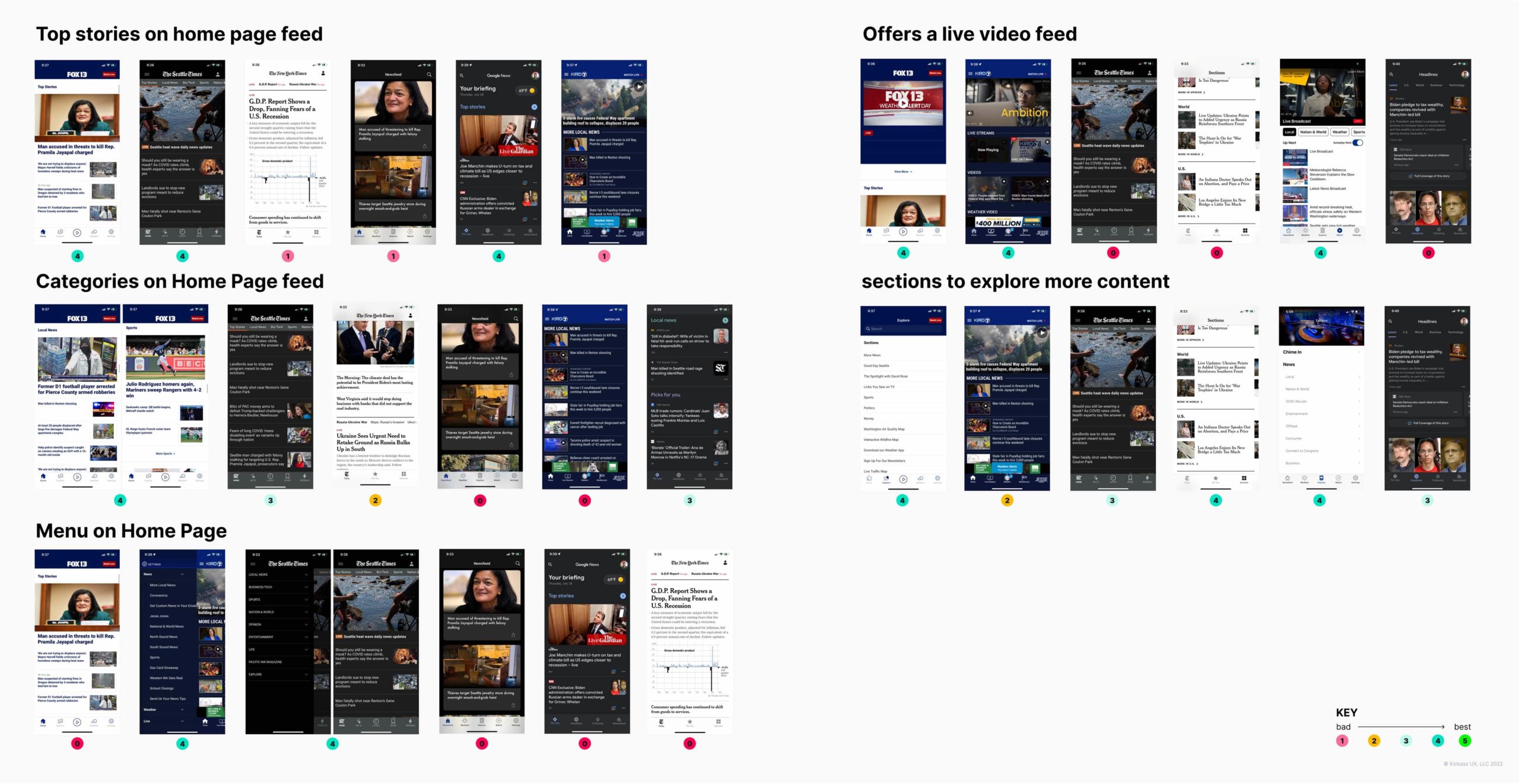
To gain a better understanding of what problem to tackle I conducted a competitive analysis and sifted through tons of user reviews to figure out where King 5 News stood and how we could make things better.
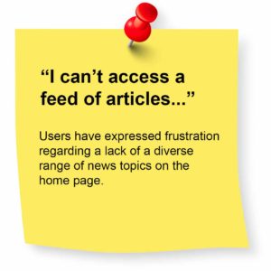
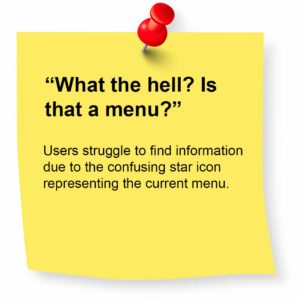
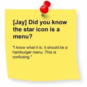
The competitive analysis shows King 5 falls behind in key areas, making competitors more appealing. For instance, the absence of a hamburger menu and quick navigation creates a confusing and less user friendly system.
There's a business opportunity here
A smoother navigation system and a broader range of news topics in the main feed can enhance user engagement and app retention.
User interviews
Key findings


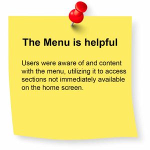

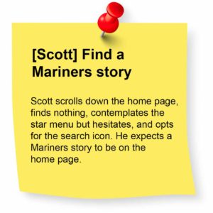
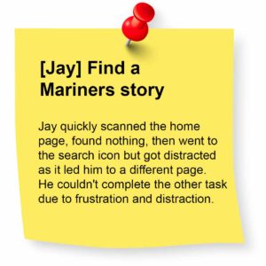
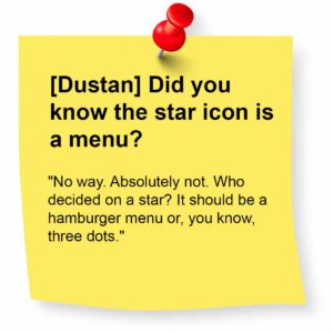
Usability testing
Key answers
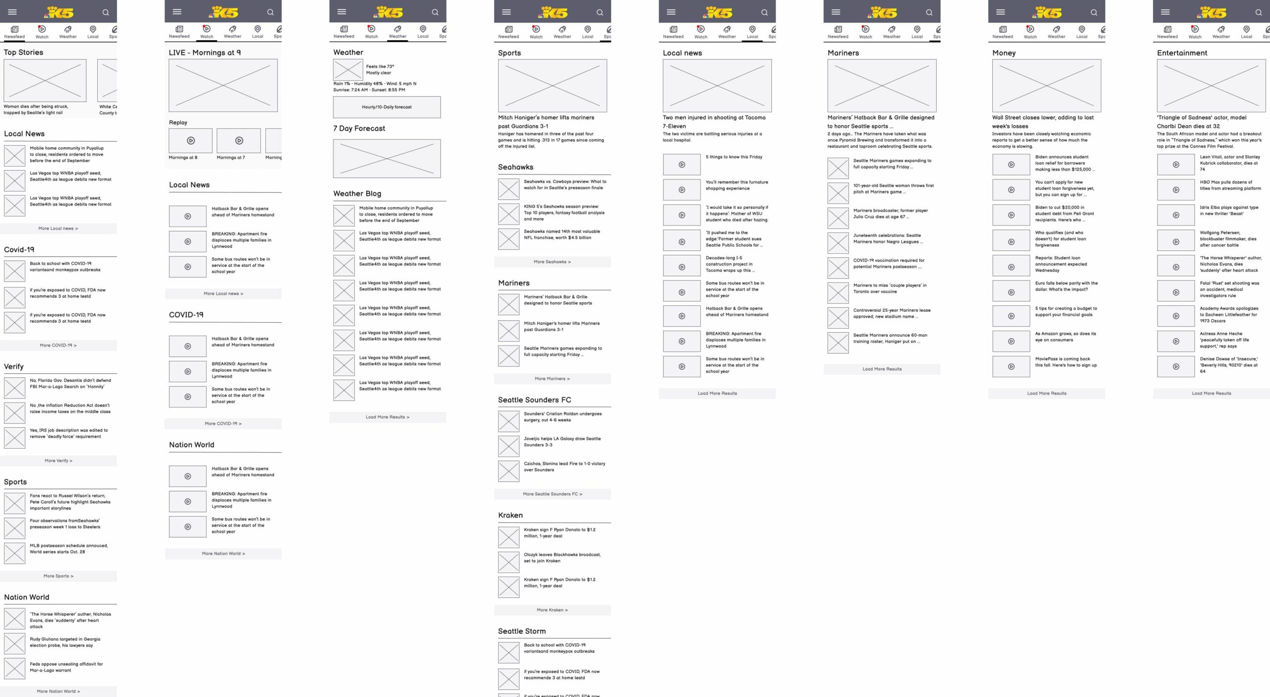
Information architecture & wireframing
competitors solutions
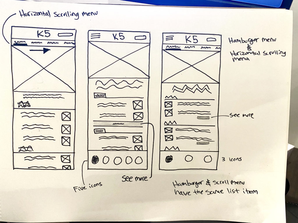
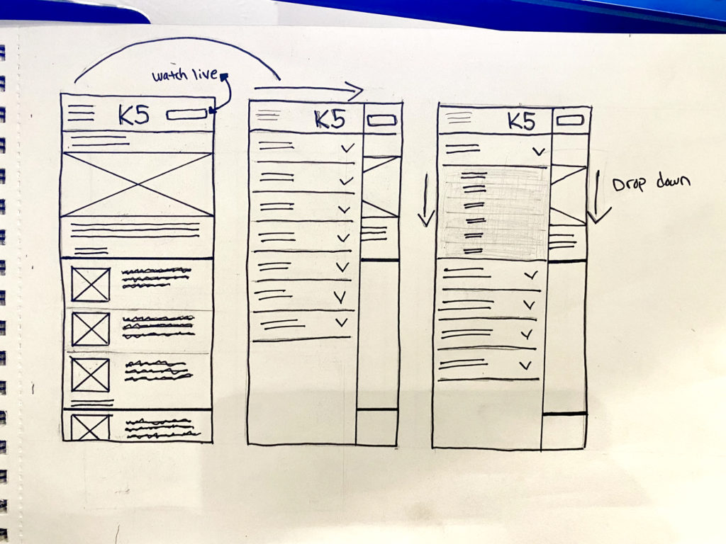
Sketching and lo-fi prototyping
Sketching
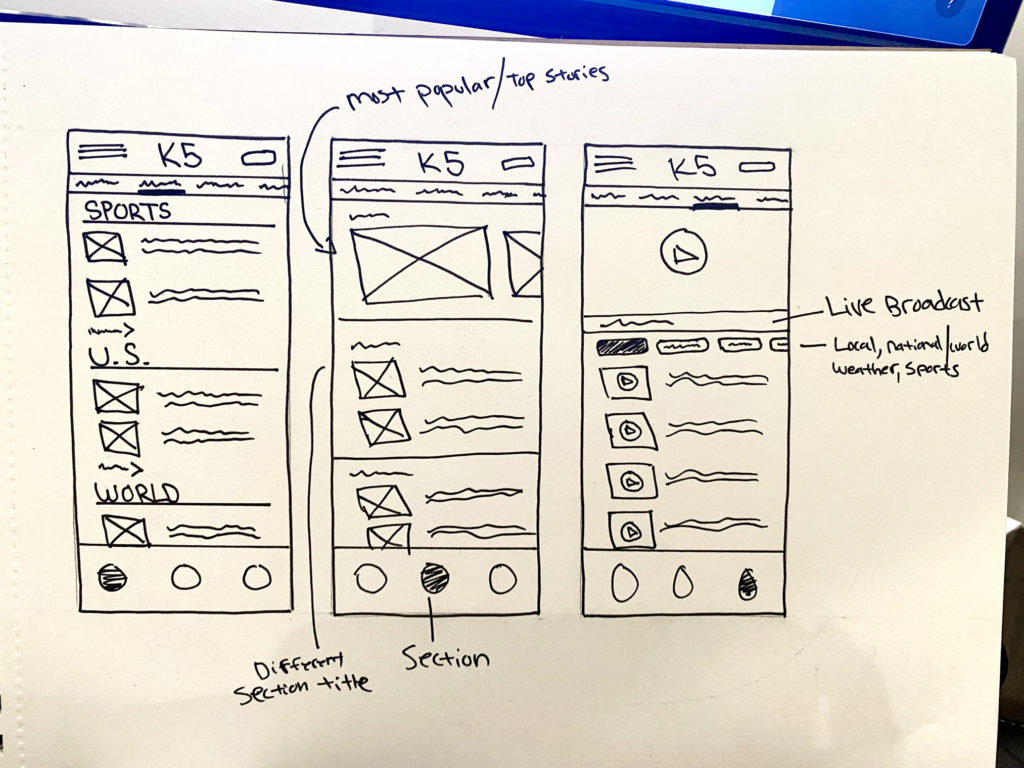
Wireframes