Numotion | Brand style guide
Numotion leads in Complex Rehab Technology (CRT) in the U.S. Here’s a brand style guide for using the Numotion logo.
Project scope
- Design
- Rebranding
- Development
My role
Graphic Designer
Download link
LOGO
The Numotion logo is comprised of three parts; the “nu” icon in the navy blue, “motion” in orange and the tagline in navy blue.
The proportion and arrangement of the logo and the tagline are specifically determined and should never be altered. Both the icon and tagline must be in the same color whichever the format used.
COLOR
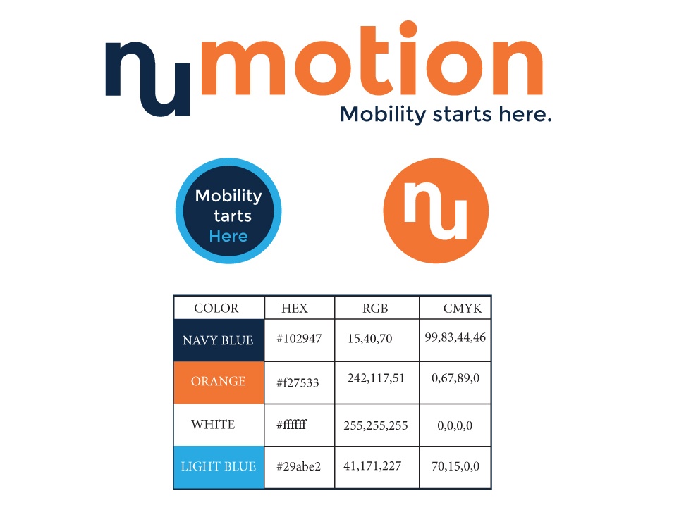
Orange is the primary color for the Numotion logo. Navy blue is the accent color found on the”nu” icon at the beginning as well as the tagline below the logo. This basic color palette emphasizes the power this company has in the industry with the bold orange while keeping a calm, comforting feel with the accent color of navy blue.
The word “motion” can be in either orange or white. The “nu” icon in the beginning and tagline below can be in navy blue, light blue or white. Both the icon and tagline need to be in the same color.
USING THE NUMOTION LOGO
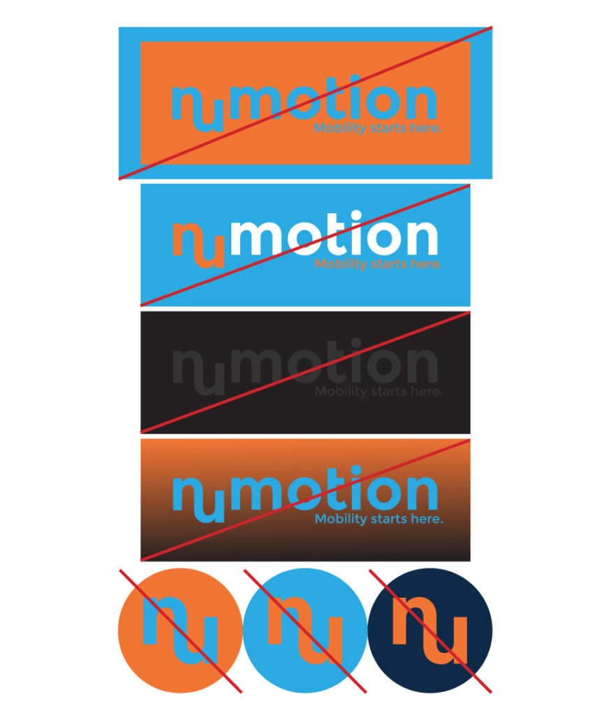
The navy blue and orange color combination is the most commonly used style with the Numotion logo. Use this wherever, whenever you can.
There should always be a white background at least one X-height around all sides no matter the color of the background.
Background colors

The white background behind the logo can be changed to these three colors and these three colors only. The word “motion” is always white while using a color background “nu” and the tagline used as the accent colors.
GREY SCALE
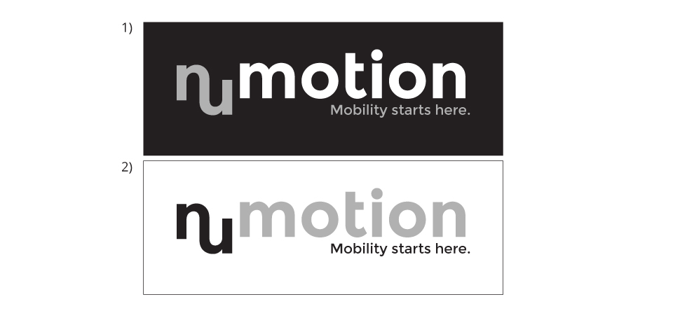
For grey scale applications, please use the following formats:
1) (motion: white) (nu: 40% black) (tagline: 40% black) (background: black)
2) (motion: 40% black) (nu: black) (tagline: black) (background: white)
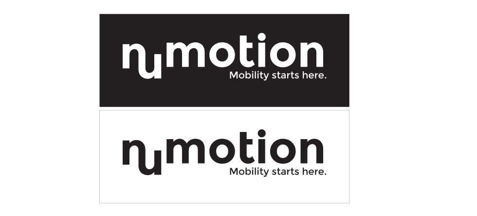
One Color:
For applications where only one color is allowed use white and black, reversing the text and background colors.
ICON
The Numotion Icon consists of the word “nu” typically white with a contrasting background. The colors can change as long as it stays within the Numotion color pallette and is legible.
WHAT NOT TO DO
TYPE
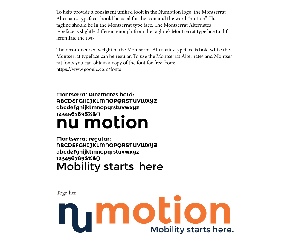
The Numotion Icon consists of the word “nu” typically white with a contrasting background. The colors can change as long as it stays within the Numotion color pallette and is legible.
CLEAR SPACE
The Numotion Icon consists of the word “nu” typically white with a contrasting background. The colors can change as long as it stays within the Numotion color pallette and is legible.